Prubaf Font: A Bold, Modern Display Typeface for Digital Branding
Yesterday, I opened Figma to refine the hero section of a new coaching website — clean layout, soft background gradient, and a headline that needed to feel both grounded and energizing. I tried three fonts before landing on Prubaf. Not because it was the flashiest, but because it struck the right balance: confident without shouting, modern without feeling cold, bold without sacrificing warmth. As a sans serif display font, Prubaf doesn’t try to be everything — it’s designed for impact, clarity, and intention.
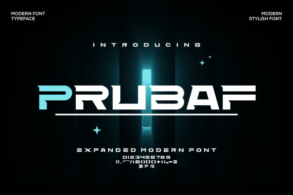
Visually, Prubaf has strong vertical stress, generous x-height, and subtle geometric precision. Its letterforms are open and airy, with just enough character in the terminals and corners to avoid feeling sterile. It’s not minimalist in the “disappearing” sense — it holds space. That makes it ideal for digital contexts where attention is fleeting and hierarchy must be immediate: hero headlines, course title cards, CTA buttons, and shop banners. I used it for the main headline (“Clarity Starts Here”) over a muted image banner — and instantly noticed how well it held up at 48px on desktop and scaled cleanly down to 36px on tablet. On mobile, I dropped it to 28px with tight line-height (1.15), and it still felt substantial, not cramped.
What surprised me most was how Prubaf behaved in real-world layouts. On a light background, its weight gives presence without glare. Over a dark or semi-transparent overlay, it stays legible — no halo effect, no blurring. I tested it in Chrome, Safari, and Edge with variable font loading enabled, and it rendered consistently across devices. No jitter, no FOIT delay when paired with a lightweight system fallback like Inter or system-ui. That reliability matters — especially when you’re shipping a client site or launching a product landing page where every millisecond of perceived performance shapes trust.
Prubaf shines brightest where typography needs to do emotional work: branding moments. Think of a boutique online store’s homepage banner (“Handcrafted Ceramics, Thoughtfully Made”), a portfolio site’s intro tagline (“Design That Listens”), or a course sales page headline (“Build Your First SaaS in 6 Weeks”). In each case, Prubaf anchors the message — not as decoration, but as voice. It’s not suited for long paragraphs or body copy (it’s a display font, not a text font), but that’s by design. Its strength lies in brevity: logos, section headers, button labels, social media cover graphics, email subject lines, and digital ad headlines.
For readability on small screens, I recommend using Prubaf only above 24px for headings — never for body text or microcopy. Avoid all-caps usage in dense UI areas; lowercase or sentence case preserves rhythm and scanability. On dark mode interfaces, test contrast carefully: Prubaf’s medium-bold weight passes WCAG AA at 28px+ against #121212, but lighter weights may fall short. And if you’re layering it over photography, add a subtle text shadow (1px black at 20% opacity) — just enough to lift it from busy backgrounds without looking heavy-handed.
Font pairing is where Prubaf reveals its versatility. I paired it with Inter for body copy on the coaching site — a harmonious match of humanist sans serifs with complementary proportions and spacing. For a more editorial feel, a restrained serif like IBM Plex Serif or Charter works beautifully in blog headers or newsletter titles. The key is contrast without conflict: let Prubaf lead, then step back with something neutral, highly legible, and optimized for screen reading. Avoid pairing it with other display fonts — no script, no ultra-thin sans, no decorative alternates — unless you’re designing a one-off campaign graphic where controlled contrast serves a specific visual story.
Before dropping Prubaf into production, I double-checked the package details. It includes OTF, WOFF2, and WOFF formats — perfect for web use. There are two weights (Regular and Bold), plus matching italics, which covers most UI needs without bloating the font stack. No variable axis yet, but the static weights are well-spaced and kerned. Multilingual support covers Latin-1, basic Greek, and Cyrillic — sufficient for most English-first digital brands with global audiences. Crucially, the license permits commercial use across websites, templates, SaaS dashboards, and client projects — no hidden restrictions for e-commerce or subscription platforms.
I also tested Prubaf in a few unexpected places — and it held up. As logo text in an SVG header? Crisp at any size. Inside a sticky navigation bar on scroll? Still legible at 20px with letter-spacing adjustment. As a hover state on a “Get Started” button? Added just enough emphasis without breaking rhythm. Even in email clients (via embedded webfont fallbacks), it rendered cleanly in Apple Mail and Outlook on Mac — though I kept fallbacks simple and declared them properly in CSS.
What makes Prubaf feel like a thoughtful addition to a digital designer’s toolkit isn’t just its aesthetics — it’s how it behaves under constraints. It respects user context: fast-loading, responsive-ready, accessible by default when used intentionally. It supports brand voice without demanding attention for attention’s sake. And it fits naturally into workflows — whether you're building a Notion-based course hub, a Webflow portfolio, a Shopify storefront, or a custom Next.js landing page.
If you’re evaluating fonts for your next project, ask yourself: does this typeface help users understand *what matters first*? Does it reinforce tone without distracting from content? Does it scale gracefully across devices and loading conditions? Prubaf answers yes — quietly, confidently, and consistently.